What makes people tick, the eternal question. What makes artists/designers tick, is the question that is always burning inside of me. When I go to an exhibition Iʻm almost more intrigued by the installation and screw choices than by the artwork itself. All of these little choices are part of the collective experience. So a few months ago, I finally put down some of my smaller but at the same time very big questions and reached out to a few designers. Micah was so prompt and thorough, and I canʻt wait for you to read his insights and familiarize yourself with his work (which Iʻm sure youʻve seen all over town, potentially without realizing he was the man behind the curtain). Thank you Micah for taking the time to enlighten me here, and hopefully lots of others!
 | NITTY GRITTY: Micah Kraus – Business: Work Studio LTD – Education/Training: 1999 BA Art Education, KSU / 2001 MA Printmaking, KSU – Doing this professionally: Art Educator from 2001-2023, Artist from 2005-current – Instagram: genarticle | workstudioltd |
1. How did you end up being a graphic designer, what specifically got you here, versus say being a painter, or even a mailperson?
MICAH: My primary creative orientation is based in printmaking, which naturally lends itself to experimentation, exploring variations and iterations of an idea, and offers the potential to efficiently create multiples of an artwork. One of my favorite things to do as a young artist was to create things that looked like commercially produced objects and insert them into unsuspecting environments – stickers, handmade books, fliers, post cards, fake postage stamps were all things that I could make and leave in libraries, offices, and grocery stores to confuse the people that encountered them. Subversive acts by a mostly innocent adolescent. In the early 2000’s the craft show scene began to really grow in places like Brooklyn and Chicago, then started finding its way to places like Cleveland and other mid-sized cities throughout the country. At the same time a couple of fellow KSU grad friends I started a t-shirt design and printing company called Campfire Goods. They were designers living in NYC that wanted to express their midwest pride, I was an artist that knew how to screen print (kind of) and wanted to do cool things with friends. We worked together to create a zillion shirt designs and started doing the craft show circuit in a bunch of cities each summer. Over the next few years of working together I learned a lot about design and digital creative programs from those two guys. They started to feed me some freelance work here and there, really holding my hand through the process of developing concepts, refining and finalizing them. I owe them both so much.
My design sensibility and process evolved over the next few years as I continued to work on freelance projects. All the while I was teaching high school art full time and showing work in galleries and museums. I loved each of those things but they each lived separate lives which created stress and a sense of dislocation. I desired to find the delta where these three all-consuming aspects of myself would come together in a sustainable and, frankly, healthy way.
Around 2017 I began working with Akron Coffee Roasters to produce artwork for coffee bags. The scope of work expanded quickly, leading to the development of merch and advertising that defined the branding of ACR. Since that time, ACR has been a creative anchor for me and has led to many projects with other businesses. I owe ACR so much.
In 2021 I formed my art & design business, Work Studio LTD. At the same time I shifted to part time teaching so that I could focus full time on my creative life. Work Studio grew steadily allowing me to leave teaching in 2023. What I’ve realized in this transition is that I am an artist. Duh, right? But it took me leaving something (teaching) to which I had dedicated so much energy, time, and love to fully recognize the imbalance in my life. Art needed to be the primary daily focus, through which instruction and service could find opportunity.
So, to answer your question – I’m not a graphic designer. Ha! I will always be an artist first. Relationships, work, eating, exercising, playing, spiritually, ethically, tying my shoes…it’s all in the context of thinking as and living as an artist (for better and for worse at times). What places me in the context of “designer” is my driving desire to find ways to get my artwork into the public realm, to connect artistically with people beyond the typical barriers of the art world, and to help people and businesses express themselves. I’ll never be the fastest, slickest, or most strategic designer. What interests me is “what if…?”, discovery through process, forging relationships, and the incredible experience of tumbling a rough edged problem in my head until a smooth gem of solution emerges. Most of the time it leads to fresh and unexpected solutions. Seeing my stuff out in the world gives me a giddy feeling, like I’ve gotten away with something.
Work Studio has three guiding principles: Create, Collaborate, Serve. Those are my compass points. When I left teaching I promised myself that if I was going to walk away from a career / calling that was so defining and meaningful I better make sure that whatever I did with my time was anchored in three things – create on a daily basis, collaborate authentically with people that will expand and challenge me, serve my community in a way that paves a way for more people to experience creativity in their lives.
2. Do you consider yourself an artist (feel free to elaborate)?
MICAH: Got that covered in Q1 🙂
3. I think good design influences us everywhere. Where are some places/things/people that give you frequent (repeated) inspiration?
MICAH: Children’s educational books from the 70’s and 80’s are one of my favorite things to look at. I have a big collection of them that I use for inspiration and reference. It’s so cool to look at something that has a fixed set of information – it can’t be updated, redacted, corrected, or unpublished. What’s on the pages of the book will remain on the pages of the book forever. Pre-digital publishing required a discipline and intention in design, illustration and photography because of the limitations of the tools that were used. It also allowed flaws and corrections by hand to remain in a way that doesn’t really exist anymore. For example, I love finding photographs in a book that are overexposed, requiring the photo editor to go in with a pencil and draw in missing elements. The visual presence of humanity in art and design connects me to it on a visceral emotional level.
4. Biggest design pet peeve?
MICAH: It changes all the time! It’s funny how time changes things – I detested the 90’s NBA aesthetic that seemed to become the go-to for every stripmall sign. Heavy drop shadow, bevel & emboss, “check it out I used all the Photoshop filters” kind of thing. Now that kind of seems charming in a retro-nostalgia kind of way.
Two enduring pet peeves:
- Bad typography in movies. Seriously. You just dropped several million dollars to create this thing and you couldn’t dedicate resources to pay attention to the positive and negative space in the title sequence??
- “Just.” That word drives me crazy. Pretty much any time “just” is said in a sentence it minimizes the effort, intention, and exploratory mindset inherent in creativity. If “just” is the starting point we’re probably not heading in the same direction.
5. Can you share 3 of your fave designs you’ve ever made and what made you choose these?
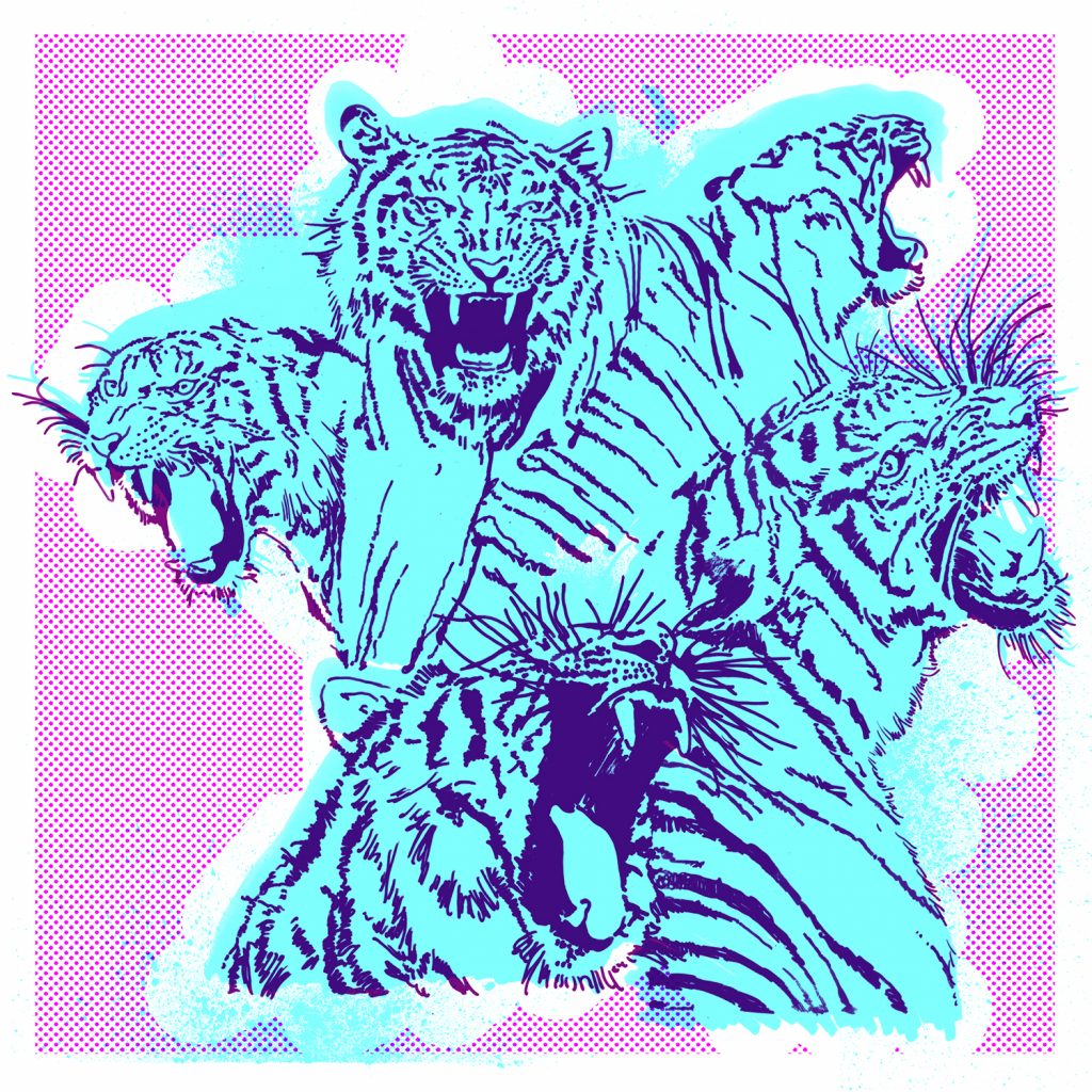
Akron Coffee Roasters Artwork
- Sumatra Harimu Tiger – This is the first time I really leaned into creating something for ACR that matched my personal aesthetic and thereby extending ACR’s branding. It felt risky to do but was received very positively and led to a lot of creative exploration and really fun brand development through merchandise.
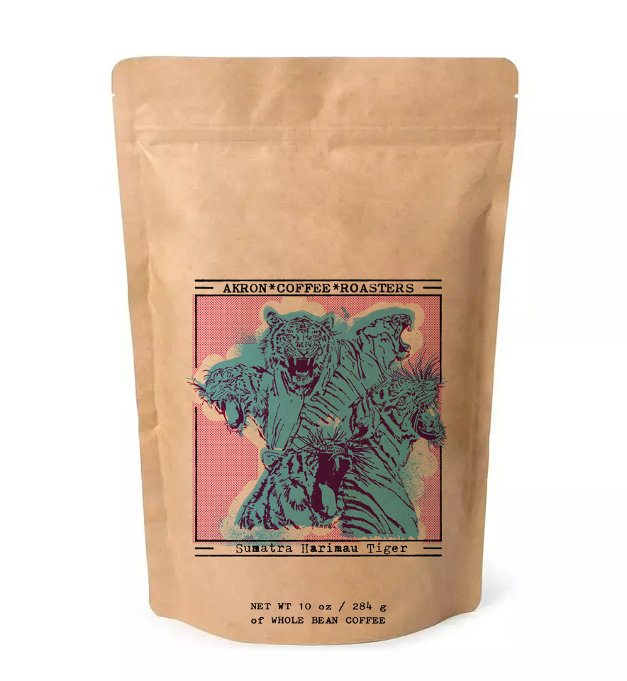
- Overall, creating artwork for ACR’s single origin coffee’s is an absolute ton of fun. I’m given the freedom to create within the boundaries of the format and function. It’s a perfect balance in that way – over the years I’ve created a lot of these and so it’s a familiar and very comfortable exercise to engage in. I think about what will read well on the display shelf, what will print well in regard to the printing process and surface, what might have potential to extend into a shirt, button or sticker, and finally I think about what kinds of things I’d like to spend time drawing. The artwork for each bag requires several hours of development before being ready for prime time and I find that process to be creatively refreshing in fulfilling way.
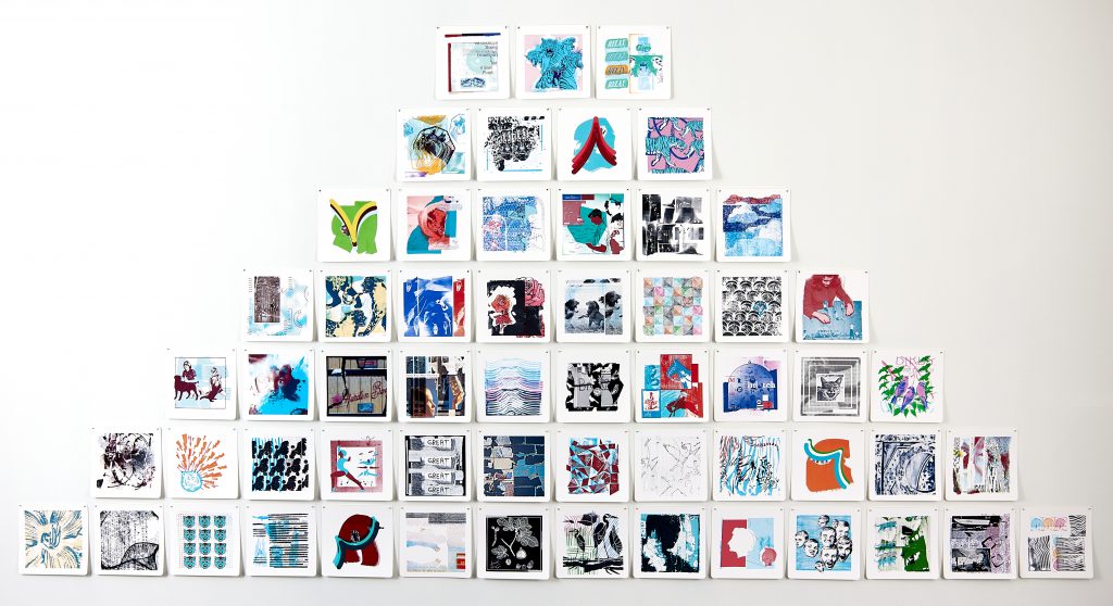
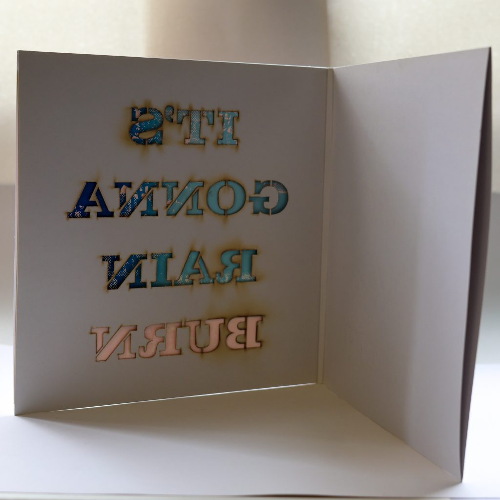
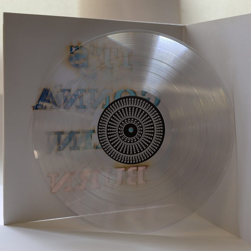
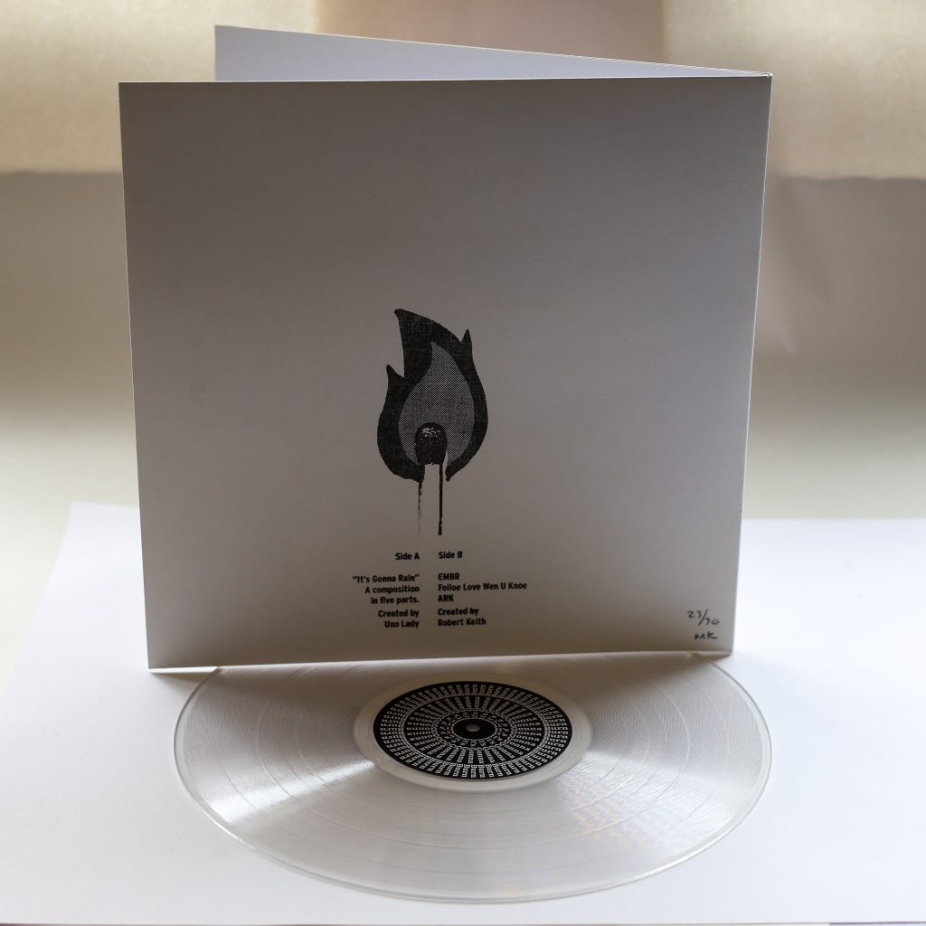
It’s Gonna Rain / It’s Gonna Burn
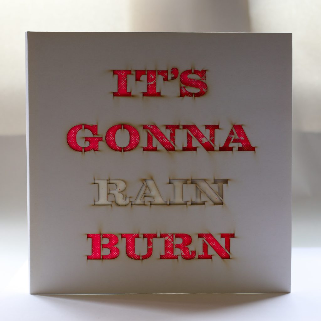
- The music on this album was created for an exhibition of my work called “It’s Gonna Rain” at Kink Contemporary in Cleveland in the fall of 2020. The year before a musician called Floco Torres created an album in reaction to one of my pieces and we included it as a kind of soundtrack to an exhibition at Akron Soul Train. Floco’s music expanded the way people connected to my work and I really desired to pursue that opportunity again. As a preparation for the show at Kink I invited four musicians to create compositions in reaction to the gospel blues song, “It’s Gonna Rain.” Uno Lady, Greg Milo, Robert Keith, and Jane Berkner & Stewart Freeman created absolutely stunning music, it was so incredible to receive these creative items from people while considering the time, talent, thought and care they’d invested. Their contribution to the exhibition at Kink created an environment out of what could have been just a collection of art on the walls. In 2022 I had the opportunity to mount a one person show at Summit Artspace, I was determined to do everything and anything exactly the way I wanted it to be done. I was never satisfied with all of that gorgeous organic music existing only as digital content, it needed to be on vinyl. So I selected songs by Uno Lady and Robert Keith for the record and went through the process of having the vinyl pressed and packaged. This led to the development of an aspect of my exhibition that I really loved – Work / Shop – a merch store in the gallery that offered affordable handmade things like screen prints, handmade notebooks, t-shirts, stickers, and the vinyl record.
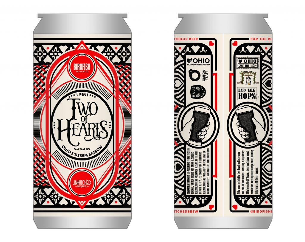
UnHitched Brewing Co. & Birdfish Brewing Co. – Two of Hearts
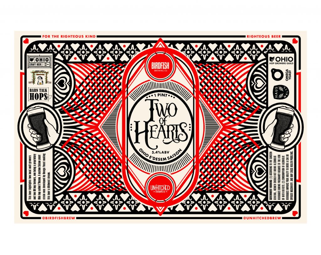
- UnHitched Brewing Co is a primary client for which I get to create all kinds of things, including beer labels. They created a brew in collaboration with Birdfish Brewing Co. and I had the opportunity to create the artwork for the can. It being a collaborative effort, the label didn’t need to adhere to brand guidelines for either brewery – I found this both exciting and overwhelming. Where to begin?? I gathered inspiration resources, sketched a bunch, made stuff that’ll never see the light of day, and finally calmed down and started relying on my creative instincts. The final label developed very clearly in my mind and then slowly took form in my sketchpad and computer screen. The result is very close to what I pictured which doesn’t happen very often for me. One reason I selected it as a favorite project is because it pushed me into new creative spaces, which felt a bit uncomfortable in an exciting (and anxiety-inducing) way. The project required me to bridge the gap between a familiar client and one that was brand new to me. It also opened the opportunity to show my work to a new audience, again exciting and a bit nerve wracking. In the end I was really pleased with how things turned out and also aware of a few things that I’d change. The project is a reminder to me of the importance of trusting my creative process – the potential, the struggle, the discovery, the outcome, and the reminder that “perfect” isn’t the motivation.
EXTRA CREDIT:
Favorite trick/tool?
MICAH: To create texture I really like to draw with ink on frosted mylar, scan it into Photoshop to clean things up and increase contrast, then print it from an old laserjet printer, then scan it again. In Photoshop I use Curves and High Pass several times to increase contrast and accentuate the texture of the laserjet print. This redundant process combines hand drawn elements with the halftone of a laserjet printer and the manipulation potential of Photoshop. Once I have the illustration dialed in I pull it over to Illustrator to play with color and layering.
To contact/hire Micah, visit his website: https://genuine-article.co
POSTSCRIPT from Liz
I have long admired Micahʻs work, and when I finally got to meet him by attending one of his Risography workshops, I was blown away by his warmth and enthusiasm. I highly encourage you to follow Micah on IG, and sign up for anything he ever offers, you will leave feeling beyond inspired. Thank you, Micah, for taking all of the time to reflect in order to answer these 5 questions and for genuinely making our community a better and more beautiful place to live!
All photos and artwork on this page were supplied by Micah Kraus.


